Echo-affordances
“Simplicity” and “authentically digital” seem to go hand in hand for many people. Something that is authentically digital is not encumbered with artifacts from reality. Drop shadows, gradients or highlights. These are imitations of 3D-form. It’s inauthentic on a 2D-plane. Simplify. That is the call of the digital designer. To free the work from the shackles of the physical; the material. Take away the gradients. The drop shadows. The highlights.
“Affordances.”
I hear someone say.
Someone who’s read Donald Norman’s book: The Design of Everyday Things.
It is a great book. Something every designer should read.
Affordances apply to the physical world. They are qualities possesed by an object that affords (makes possible) an action to an actor. Norman uses it to mean something that makes the possibility of that action clear. Doors with handles are pulled. Handles afford pulling. Doors which should be pushed, should have a plate. It is clear I cannot pull a door without a handle. In the same way, buttons afford pushing. Pages of a book afford turning.
In the digital world, we have brought affordances along for the ride. The gradients, drop-shadows and highlights make clear how you can interact with our interfaces. And how the interfaces will react to those interactions.
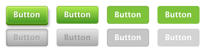
Except there’s a slight difference. An important one. Our interfaces often echo reality. The affordances aren’t real. Rather, they remind us of an affordance we’ve already encountered. Buttons look like buttons. That’s how we know we can click them (push them in). That’s why we design them to mimic having form, because the form affords.
It’s easy to see why we react to flat design in the ways that we do. Simplicity is about removing excess information. And in digital design, that’s often removing the imitations of reality. But these imitations are often the information we believe is so important. We think they provide us affordances. We think they make our interfaces clear.
In flat design, clarity becomes a casualty of simplicity.
But these imitations don’t provide us affordances. A digital button cannot be pressed in. It is clicked. There is no affordance, only a reminder of one. And this is key. The digital button echoes an affordance that we already know from a physical button. These echo-affordances aren’t themselves affordances. They are reminders. Signifiers.
If gradients and drop-shadow don’t afford, affordances are not a reason to choose skeuemorphism. Flat-design can also contain design elements that echo these affordances to us. The question is, how many of these echoes do we need, before we are reminded of the real affordance?
At the start, it may have been a great number. Digital buttons needed gradients, drop-shadows and highlights to remind us of the physical form, and what it affords. But as time goes on, we need to be reminded less of the form, and more of the idea of a button itself.
The whole point of an echo-affordance is to communicate a memory, or an understanding. Much like the floppy disk now means “Save” more than “portable memory”, some echo-affordances transcend their literal origins. It is through repetition, and consistent use, that these design elements become shared cultural signifiers.
Buttons when acted upon, do something. Much like buttons in real life. There are some UI elements that don’t resemble anything in real life because there is no metaphor that makes sense. Nothing in real life can instantly transport us elsewhere, so there is no benefit to making links resemble anything physical. We know what hyperlinks are because of the consistency and repetition of its signifiers. Not because of an affordance.
Recently, I’ve spent a lot of time thinking about design systems. Thinking about the Visual DNA of a design system. How can one distil something’s Visual DNA? Finding the essence of something is generally about stripping back. Stripping back everything that is not that thing. Reducing options. Throwing up limits and restrictions. Creating the kind of freedom for designers to work within. Instead of the kind where they get lost amongst the infinite options and possibilities.
But what are we stripping back to?
When we think about the Visual DNA of a product. We distil the echo-affordances of each thing (a button, or a link) to the essential signifiers. And we hammer those home. We don’t stray from them.
When we stray from using real affordances (like in the digital world), it becomes important that our use of signifiers remain rational and cohesive. The more echo-affordances we strip, the more tenuous the abstract links between digital and physical become. Thus, it’s important that we protect and strengthen the abstract links (signifiers) we choose to leave behind.
This is why Visual DNA and design systems are so important in digital design. They reinforce the echoes we choose to keep (signifiers), in light of the many we choose to throw away (echo-affordances) when we simplify.
So that, in the end, clarity isn’t a casualty of simplicity.